Tesla’s instrument cluster hasn’t seen many updates since the automaker started focusing on Model 3 and Model Y, which don’t have a traditional instrument cluster.
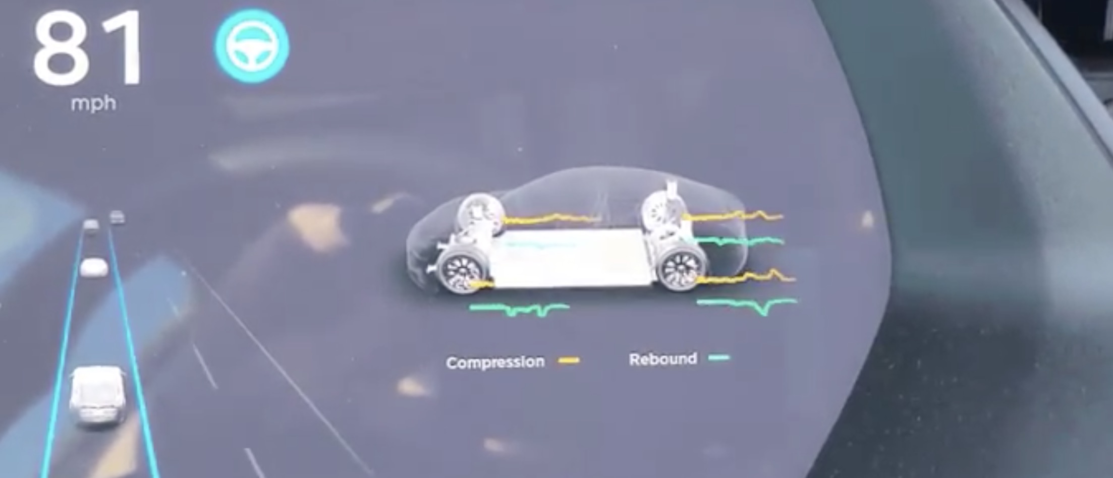
But it has now gotten a rare new update: a new suspension widget.
With Model 3 and Model Y, Tesla changed its interior user experience to have everything go through a center display.
Model S and Model X still have an instrument cluster, but Tesla has shifted its user interface to focus on the horizontal design of the Model 3 and Model Y’s center screen.
We haven’t seen many developments in the instrument cluster user interface until now.
With a recent update to its suspension software for the Model S and Model X Raven vehicles, Tesla has also added a new suspension widget for the instrument cluster (via u/Tuppaca):
Model S and Model X vehicles have long been equipped with a standard “smart” air suspension, but when Tesla launched the new Raven Model S and Model X vehicles last year, it updated the vehicles with a new adaptive suspension.
Tesla described the new suspension:
We’ve also upgraded our air suspension system for Model S and Model X with fully adaptive damping, giving it an ultra-cushioned feel when cruising on the highway or using Autopilot, and a responsive, exhilarating confidence during dynamic driving.
At the time, the automaker said that it would be able to release more features to this new suspension system over time.
Last month, we started seeing that with Tesla starting to release the software update 2020.32.1 with interesting new features, including new suspension settings.
It included a new real-time visualization of the suspension performance, and now we see that going to the instrument cluster widget.
Model S and Model X owners are able to choose between several widgets, like navigation, music, tire pressure, and now suspension.
FTC: We use income earning auto affiliate links. More.
Subscribe to Electrek on YouTube for exclusive videos and subscribe to the podcast.
